Posted: Friday 5 November 2021
Our Favourite Paint Colours – Whites & Neutrals
Choosing paint colours can feel like a daunting task as the options and interior design trends are endless which can make the process feel very overwhelming.
We receive many inquiries about the neutral paint colours used in our projects, so we want to share our go-to choices for neutral palettes. After years of experimentation, we’ve narrowed it down to the basics of neutral interior design that we believe can complement almost any home. Our goal is to simplify the selection process and provide the best recommendations to help you create a cohesive and beautiful look in your space.
Once you have narrowed down your own selection, one big piece of advice is to make sure you do a big enough swatch, of about 20 x 30cm, of each colour and finish in each room and on different walls. Light can have a big impact on the colour especially throughout the day, so you want to make sure that this colour is right for your scheme through the day.
Keep reading if you would like to hear our favourite neutral paint colours.
WHITES & NEUTRALS
White is just white, right?
White should not be mistaken for simply just white. Even a white can have so many different options in undertone, and each shade, tone & finish can create a totally different feel to a space. Natural light should be reconsidered when selecting the perfect white!
In North facing rooms the light tends to bring out the cooler tones within a colour, so you may want to offset this and go for something warmer if a cool tone isn’t for you.
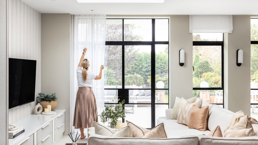
South facing rooms are usually filled with warm light all day, making them one of the easiest rooms to choose a palette for. We have collated our tried & tested whites & neutrals below…
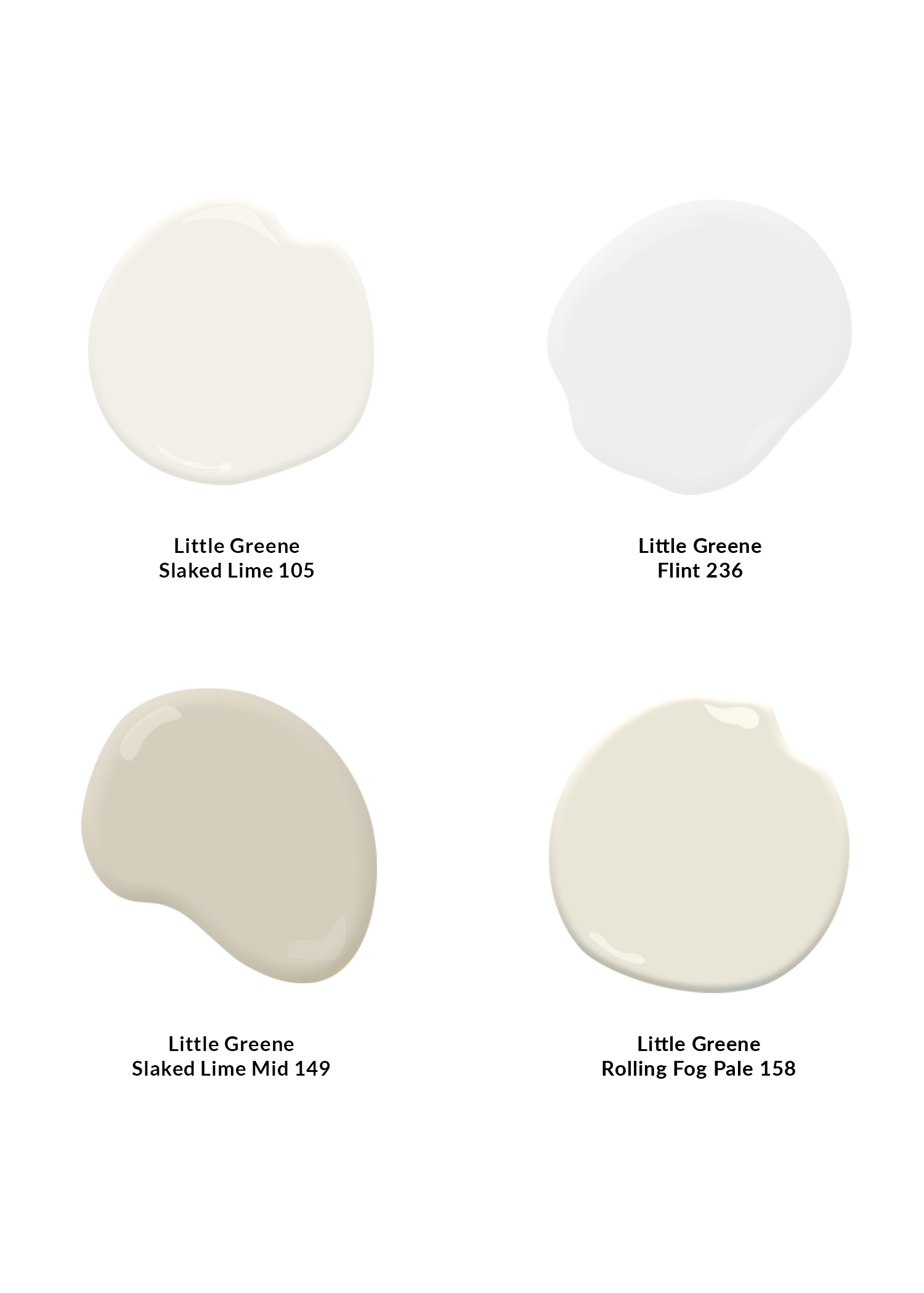
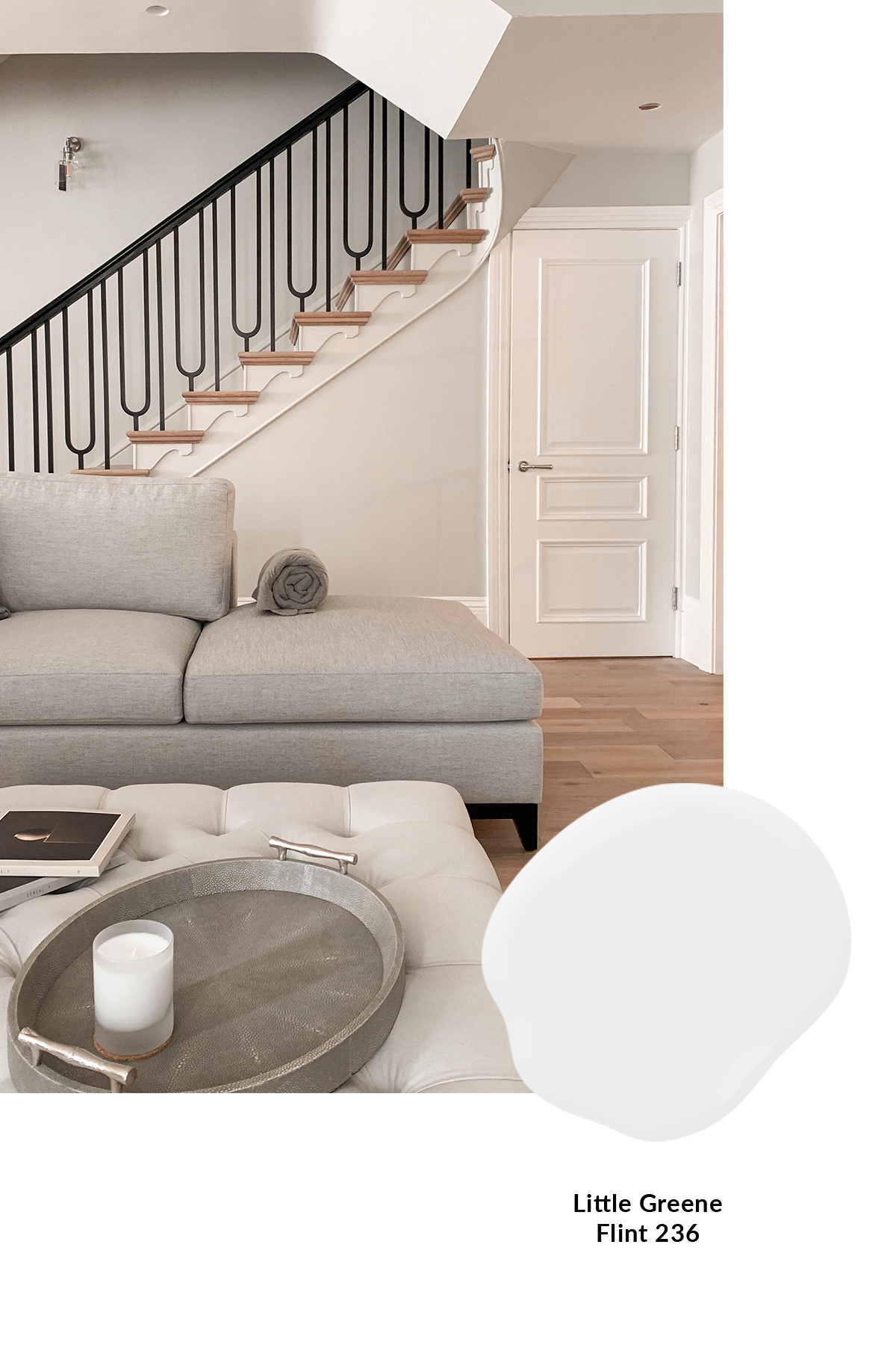
LITTLE GREENE FLINT 236
Brilliant white is very stark, so if we are after a crisp, clean white, Little Greene Flint 236 is our chosen one as it has a much softer tone making it a more liveable colour. This is our “go to” when doing pure white woodwork, as seen here on the internal doors, architraves and skirtings in one of our projects as it is a sophisticated warm white. If you’re looking for a bright white with minimal undertones, this could be the one for you!
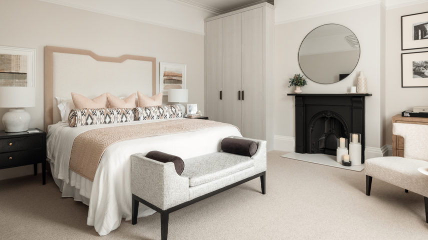
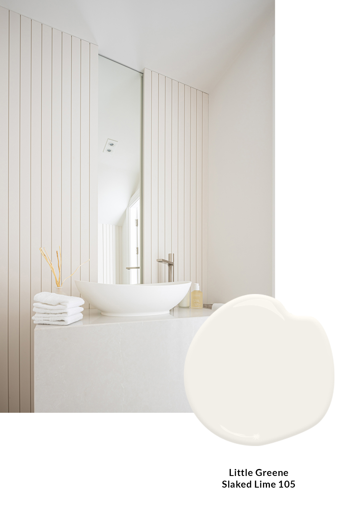
LITTLE GREENE SLAKED LIME 105
Little Greene Slaked Lime 105 is a radiant masterpiece, boasting a pure and crisp white hue, whilst presenting an element of freshness avoiding any hints of grey tones. We recently had the pleasure of employing this remarkable shade in one of our projects, transforming a light-deprived powder room. With no natural light to rely on, we sought a white tone that would exude alluring neutrality and Slaked Lime 105 emerged as the perfect choice.
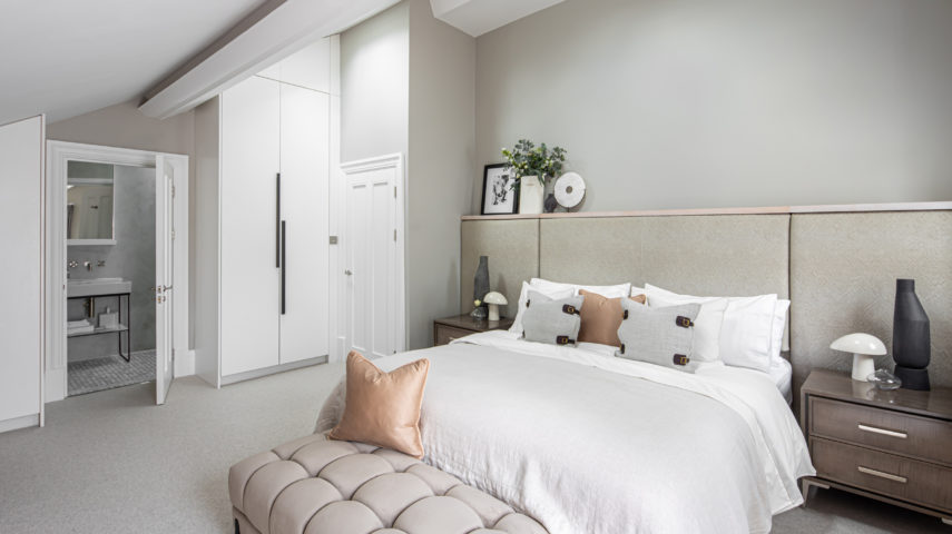
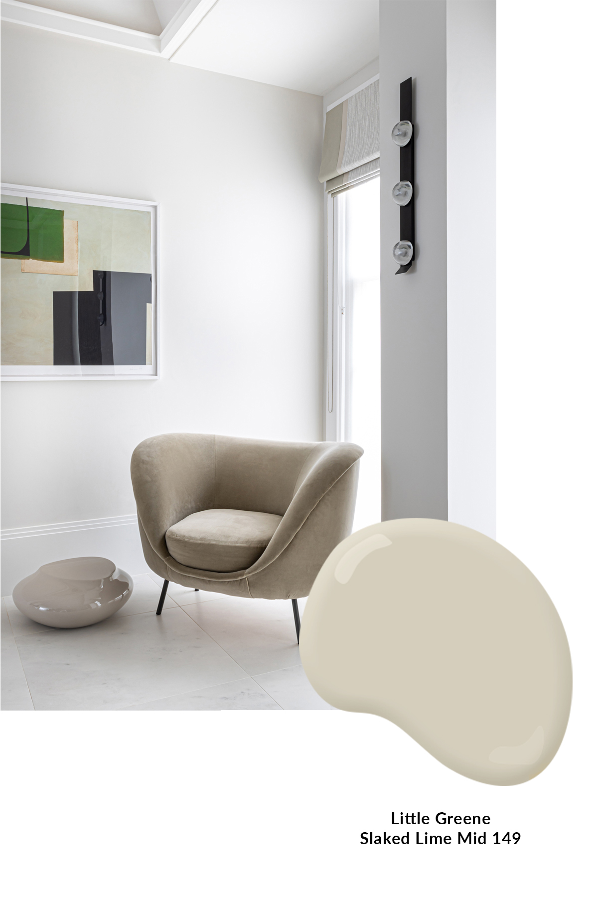
LITTLE GREENE SLAKED LIME MID 149
Warm & creamy are words often used to describe Slaked Lime Mid 149 by Little Greene. This mid shade is a warmer neutral paint colour than classic Slaked Lime 105 Above. It’s a great option for more traditional spaces and works well with other neutral tones and fresh hues. We used it throughout the open plan kitchen, dining, and hallway of our Edgbaston residence for a cohesive palette.
This is one of our all-time favourite neutral paint colours and we even have this is our Design Studio!
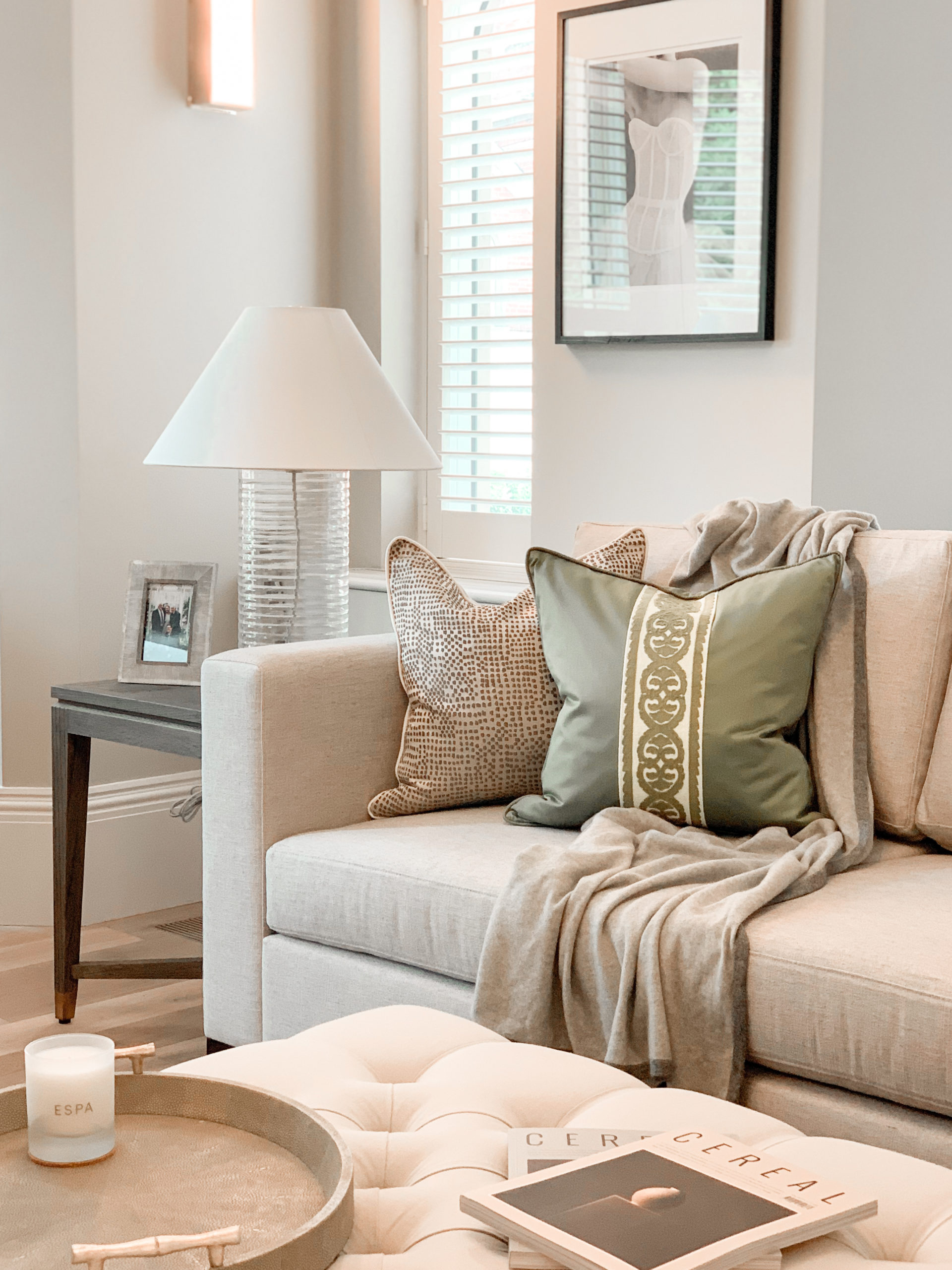
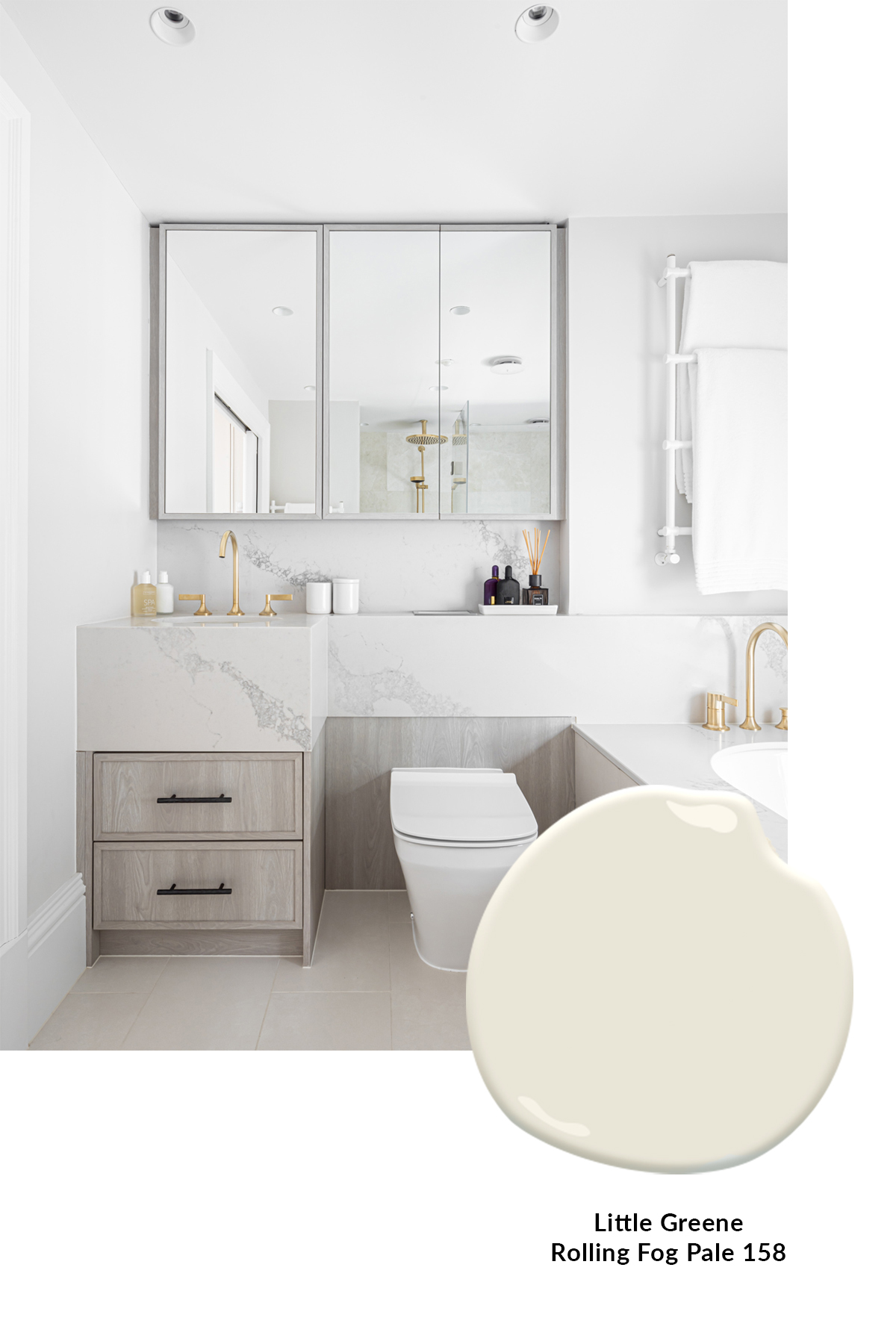
LITTLE GREENE ROLLING FOG PALE 158
Warm yet airy, Little Greene’s Rolling Fog Pale 158 is a perfect shade to go for when you are trying to achieve a subtle warmth in a space like this en-suite bathroom. To create the welcoming feel, we wanted a warmth to come through in the wall colour, this delightful pale tone is timeless and can be used in both modern and period properties.
Similar Articles